Technical analysis is simply a study of the price action of the underlying stocks. Price action is the movement of the stock’s price over time. It is the basis for all the technical analysis of the stock.
How can you see and assess the price action? That’s where the chart comes into play. The chart is the backbone of the technical analysis. Now, let’s see how to construct a chart. First of all, do not be intimidated by all these new fancy words if you are new here. it’s actually pretty simple as we are not going to create anything new. It’s all already premade and ready to use.
Before we jump into charts, let’s get familiar with the terminologies used in the trading platforms. Make sure you understand them thoroughly as any misunderstanding can cost you money.
MARKET HOURS : Regular market hours are between 9.30 am and 4 pm EST. Whenever you hear that market is open, it refers to this particular timeframe.
PREMARKET: Premarket is anywhere between 4 am and 9.30 am. Some brokerages let you trade from 4 am but most let you trade from 7 am. The amount of trading in this timeframe is very small unless there is significant news for a particular stock.
AFTERHOURS: Afterhours are anywhere between 4 pm and 8 pm. Most brokerages let you trade in this timeframe. Again the volume is small unless there is any news.
From now on, all the following details refer to regular hours of trading.
OPEN: The first trading price of a stock at 9.30 am.
HIGH: The highest price of the stock on that particular day.
LOW: The lowest price of the stock on that particular day.
CLOSE: The last trading price of the stock at 4 PM.
VOLUME: This is the total number of shares exchanged between the buyers and sellers during the day.
BID PRICE: This is the price a buyer is willing to pay for a particular stock
ASK PRICE: This is the price a seller is willing to pay for a particular stock.
Now that we are getting familiar with the terminologies, let’s jump into charts. A chart has basically two components, price and time. Using these 2 information, the chart can be made into 3 different formats namely Linechart, Barchart, and Candlestick chart. It doesn’t matter which format you use, the underlying principle is the same. I primarily use a candlestick chart but I will touch base with the other 2 formats as well for educational purposes.
I am going to use APPLE stock (AAPL) for the following descriptions. The timeframe I am using is one day, which means each line, bar, or candle denotes a 1-day price action of AAPL.
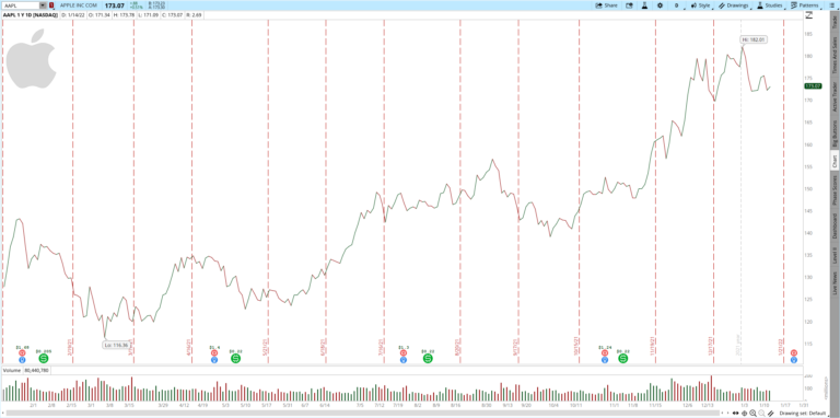
LINECHART: A linechart is formed by connecting just the closing price of the stock. Some traders believe, the only important price is the closing price and primarily use linechart. Below is the linechart of AAPL for a one year period. I sometimes use linechart to draw support and resistance as linechart is a clear looking chart of all. More on that later.

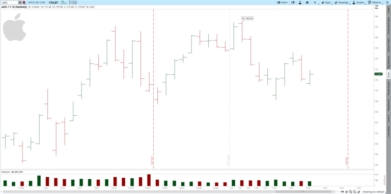
BAR CHART : A single bar in the barchart includes open, close, high and low of the particular stock. Below is the barchart of AAPL. If AAPL closes more than the open price, that bar will be green. If it closes lower than the open price, that bar will be red. The smaller line on the left denotes the open price and the one on the right denotes the close price.

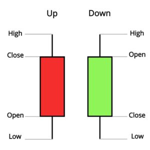
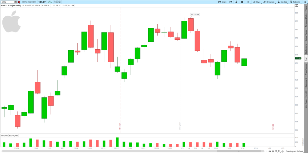
Candlestick Chart: This is similar to the Barchart. The difference is the open and closing price are included in the body of the candle rather than a line on the left or the right. The candle is green if it closes more than the open price and red if vice versa.


In the next article, we will see about support and resistances, their use, and how to draw them.